Or follow me on Twitter or LinkedIn and stay in touch.
Anne-Marie van Geloven
|
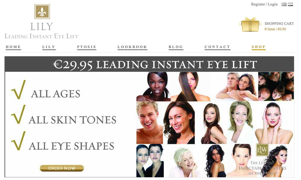
In 2012 I've launched an innovative medical grade eye lift strip called . It's the first and only product developed for Lily Leading Instant Eye Lift, botulinum toxin related ptosis (droopy eyelid) which became increasingly popular to use for create a temporary eye lift by makeup artists and customers with aging or hanging upper eyelids. Lily Leading Instant Eye Lift is sold in my online shop. Ever since, I started blogging more often about cosmetic related topics and of course injectables like botulinum toxin and dermal fillers. Here is the link to my new blog. I hope you'll visit me there to read my latest online articles.
Or follow me on Twitter or LinkedIn and stay in touch. Anne-Marie van Geloven
2 Comments
Color your Social Network, Practice, Office, Brand, Message and Discount! What colors to use: Red can be well used for your OTC products & food. Pink for your feminine products and gentle skin care. Green for fertility, alternative medicines, health spa’s and online advertising “call-to-action” buttons. Blue for your office, production site, gym and wellness centre. Dark blue for your luxury goods for men and corporate branding. Bright blue for your health spa, beauty clinic, relaxation room, deodorant, toothpaste and your dining room (if you want to lose weight). Yellow for energy drinks, sports equipment, vitamin supplements, social network, reading, luxury goods for women. White for skin care and combined with other tone for your clinic. Black for your luxury goods (for men), luxury services and hotels, erotic good (especially combined with red). Orange for sports services, adventure holidays, theme park rides, low budget businesses, sale, discounts am value for money ads. Purple for erotic items for women, luxury goods, making cheap look more expensive and all girl advertising Brown, like blue for men and if you want to add some credibility to your message. Colors play a key role in the success of your brand or marketing campaign. Color get’s noticed by your customer and can help you to communicate your message. Read more about the specific colors......... Red Red, the most vibrant and powerful of colors, seems like a good place to start. Studies have shown that it's the first color babies recognize, and one that continues to appeal to most people throughout their childhood and into their adult lives. At a purely symbolic level, it's the color of fire and blood, an association that's common to all cultures and therefore extremely powerful. Less specifically, it's a color that seems to be associated with energy, war, danger and power, not to mention passion, desire, and love. What does that mean for marketing? To start with, some of these associations are so deeply ingrained that it wouldn't be wise to use a color other than red to represent certain states. Try depicting extreme emotions such as violence or passion with shades of blue and you're going to run into problems. It has been shown that in its brighter variations (tomato, pillar-box), red actually provokes a physical response by raising respiration rate and blood pressureFor this reason, its use in 'sexy' advertising scenarios or as an erotically charged statement - on lips or fingernails - should quite literally set hearts beating faster, it's regarded as equally arousing by men and women. Whether the physiological 'red effect' occurs simply as a result of its associations; or because the color itself somehow provokes such a response; or, if, indeed, this effect relies on a combination of the two isn't something that necessarily matters here. What is important is that red, like virtually every other color, exerts a measurable influence on the consumer. Red's association with force, and power, is an extremely dominant one. Red is an ideal color to suggest fast-moving action or extreme force, like computer games, action-adventure books or movies. Red is a good choice for any product that seeks to impart the idea of improvement, rapidity or physical change. A few examples include anything related to sport or speed (think of those red sports cars), energy drinks, self-help guides, or batteries. Even 'fast-acting' or 'powerful' over-the-counter drugs can support their status with at least a dash of red. Perhaps as a result of all that heavy breathing, red also increases appetite, making it an excellent choice for advertising food (it's popularly claimed that Chinese restaurants often use red color schemes for this reason, but there's little truth in this - red simply happens to be a very popular and 'lucky' color in Chinese culture). However, if enticing diners to eat heartily is something you're aiming to do, an all-red environment is a good way to get stomachs rumbling. Pink Pink is usually perceived as a warm and fairly upbeat color, it is associated with femininity and even passivity. Research showed pink has significant calming qualities. Pink does induces a temporary sensation of calm and this is a powerful factor in the color-coordinated approach to advertising. Pink is peaceful, relaxing and general evocates comfort and softness - a great color for items such as toilet paper, cotton wool and 'gentle on the skin' toiletries, especially baby lotions. The strong association with femininity means that anything 'too' pink is likely to be snubbed by men. It's well known that a high concentration of color in foodstuffs will lead consumers to believe they're tastier, or even identify a flavor that isn't actually present. Pink coloring is a particularly effective way of suggesting sweetness. Pink is often used as a coloring in candies and is powerful enough to substantially increase a food's perceived sugariness or even depth of flavor. Pink sprinkles or toppings will add oomph to vanilla ice cream, and pink marshmallows are often assumed to be sweeter than white ones – although they are not. Sugary foods may have lost much of their popularity, the marketing of certain products is still likely to benefit from a little pink-appeal: feel-good desserts, ice creams, shakes and certainly artificial sweeteners. It's also a color that could be used to make sugar-free, healthier foods seem more enticing to kids. Green Occurring naturally as a sign of plant growth and renewal, green is one of those colors that's universally seen as positive, fresh and fertile. it's the easiest color for the eye to assimilate and therefore one of the most relaxing. Green induces feelings of calm and restfulness, and can even improve vision. Green is a very positive color. This emphasis on nature, freshness and renewal means that it's commonly used to emphasize the cleansing, 'regenerative' aspect of household items such as bleaches, detergents, air fresheners. Green has evolved into the symbol of all that's ecologically aware. Green suggests the product is all-natural, organic or additive-free, even when it isn’t. The notion that what's implied about a product should be supported by its reality - is one of the most vital aspects of marketing. Get this wrong, and there's no consumer forgiveness. Wholesome, healthy food items are likely to be identified as such through predominant use of green, and the same can be said for products or services associated with any type of healing, spirituality, or personal growth: yoga, slimming programs, alternative medicines. Different greens have different meanings.Green is a symbolically complex color, and particular shades transmit subtly different messages. Darker greens - the classic color of bank-notes and bills - have long held an association with finance. The added implication of growth and fertility therefore makes green a good choice for promotion of many financial products, particularly saving schemes, pensions and insurance plans. Lime greens, which emerged as popular trend color in the '90s, denote an especially vibrant freshness due to their close relationship to effervescent yellows. As such, they make excellent keynote colors for fresh, healthy, energy-inducing products such as juices, tonics, vitamin supplements and energy drinks. Green’s link with movement, forward motion and vehicles make it a potentially good choice for anything related to transport: carriers, train networks, buses. And for online advertising, try using green for buttons or links you'd particularly like clicked - you're practically inviting a user to go ahead and do so. Blue Blue is by far the world's most popular color. Like green, it occurs in nature - the hue of skies, water and sea. Unlike very warm colors, which provoke impulsive, passionate responses, blue is a cerebral color that's commonly associated with clear thinking and intellect. Used in offices and workplaces blue has been shown to dramatically increase productivity and a sense of well-being. Perhaps more surprisingly, other studies indicate that blue can even improve physical prowess - weight-lifters typically perform better in blue surroundings. Blue has the ability to sharpen concentration and the association with clear thought and precision make blue a good choice for anything involving a high degree of complex manufacture, such as computing products, electronic goods or hi-tech appliances in general. Darker blues emphasize this association even further, and their appeal among men provide a perfect keynote for high-end, precision-made items with a masculine focus - expensive cars, bespoke tailoring, luxury grooming products. Blue emerges as a clear favorite in the corporate world. Blue implicates steadiness and reason, making it an effective choice for much company branding, although its white collar associations can also suggest stuffiness and conservatism.In its lighter, brighter shades, blue takes on happier, sparkling and spontaneous overtones. The pure and natural aspect of such blues convey a sense of cleanliness and freshness and are often used for cleaning products, detergents, deodorants and toothpastes. Bright blue is also an obvious choice for the typical vacation. Evocative of cloudless skies and inviting pools or seas, it also gives a tantalizing taste of tranquility and relaxation by slowing down the metabolism and producing feelings of calm and well-being. A powerful message indeed, and one that makes blue an equally effective choice for health spas, beauty clinics and any other service where deep relaxation or therapy is a key selling point. Foods, particularly meats, dairy products and staples such as pasta or rice, really don't benefit from any kind of association with blue. To start with, the drop in metabolism will certainly reduce the appetite. It's been suggested that we instinctively associate blue with something that's rotten and unsafe to eat, not a great choice for marketing a ready-meal. Yellow Yellow is vibrant, energetic and fun - it's the color of sunshine, flame and fire and is closely associated with warmth, happiness and the positive energy such states create. Yellow produces bodily responses that are perfectly in keeping with this reading, too; an instant feeling of well-being along with a noticeable boost to mental activity. Yellow effectively communicates the nature of products associated with vitality and stimulus, such as energy drinks, sports equipment, vitamin supplements or remedies. And as the perfect feel-good color, it's a great choice too for promoting group leisure activities, clubs and social networks. Visually, yellow has a high impact that's hard to ignore, a fact reflected in its use for items such as sticky notes and highlighter inks. Yellow sharpens attention, therefore consider lighter yellows as a background for large amounts of text, especially copy that requires close attention such as tutorials, instructions, or rules and regulations. Very light yellows can often appear drab, especially on-screen, while brighter shades tend to become overpowering. The yellow effect is an intense one, and its enervating qualities can quickly put people on edge. Yellow rooms make babies cry more, and they also provoke hot tempers and arguments. Yellow is a color that can be used to market most products to women - from washing up gloves to expensive scents - men are far less likely to appreciate it. White Pristine and pure, white appropriately signifies cleanliness, spiritual health and, of course, purity in most cultures. White is considered a “non-color”, and ideal choice for products wanting to accentuate their unadulterated, un-tampered with and goodness: no-frills items, reduced fat, low-sugar or no-additive foods, pure juices, skin-care products. White is also the classic 'clean' color, providing the easiest way to add a sense of uncluttered spaciousness to print or screen graphics. It is association with cleanliness and hygiene. White clearly shows dirt and is commonly used in hospitals and has a certain clinical quality that can deprive a marketing message of warmth or even context. For this reason, it's best used with an accent color to combine the best of two worlds - the visual clarity of white and the emotional resonance of a carefully chosen highlight. On-screen, the combination of light-filled white with black text is fairly hard on the eye. Try choosing a tinted background for large quantities of copy like light yellow, or change the color of the text itself. (see notes for more on white) Black Although in western culture the color black certainly holds several negative linguistic connotations (black magic, black market) it's also very positively associated with authority, prestige and exclusivity (black tie event, black credit card). In general, black can be used very effectively to denote cool sophistication and a powerful sense of extreme luxury or expense. Black is a color that creates a real sense of depth while also focusing the attention more completely than white. Black makes an ideal backdrop for images of luxury goods or services such as high-end hotels. Men seem to respond particularly well to such a combination. For men, black is a color with marked erotic overtones (combine it with red and you're onto a testosterone-charged winner that's bound to attract male attention!) Black is also by far the most common text color; perfect in print, although on-screen the contrast with white can often seem harsh. Consider using a very dark gray instead. Colored text against a black background is rarely a good idea except in small areas, as black backgrounds diminish readability and will quickly tire viewers. Orange Orange is a color that's clearly suggestive of fun, warmth and pleasure. Orange exerts an invigorating effect by increasing oxygen to the brain and stimulating mental activity. It's therefore an excellent choice for any product associated with energy and vigor, such as sporting equipment or services, adventure holidays, theme park rides, energy drinks. Orange can impart very similar messages to red, but importantly, without its slightly aggressive edge. Orange is the best color at stimulating appetite. You may notice a lot of it in the snack or candy shelves near a checkout. Orange ability to generate sudden hunger pangs will often lead to impulse purchases. Orange in brighter shades is perceived as lacking prestige. High visibility means it's a frequent factor in motel signs, fast food outlets and similar 'low-frills' businesses, it's a color that's become associated with lower-budget options and shouldn't be used extensively for products wanting to impart a high quality message. The opposite also holds true, however, making it a very good choice to indicate value for money, savings and discounts. Purple Mysterious, alluring, and very definitely regal, purple is a relatively uncommon color in nature. In the ancient world, its scarcity meant that it was highly valued, and rare, expensive purple dyes were used exclusively by nobility. This association with wealth and prestige remains to this day, making purple, especially in its darker shades, an excellent complement to luxury items. The association with expense is so strong that it can even be used to add a touch of instant class to cheaper products. Purple also has some interesting hidden talents. Many women find it an extremely erotic color, making it the female equivalent of the guys' libido-enhancing black. In fact, purple turns out to be a very girly color indeed - far more so than pink. It's a definite hit amongst young and almost 75% of adolescent girls rate it their favorite color. So while men seem fairly neutral about purple, if you're looking for a color that speaks directly to the ladies, this may well be the one to choose. Brown
Brown, along with blue, is consistently voted a favorite color by men. Solid, earthy, dependable. It resonates with a sense of trustworthiness and dependability. If that's the kind of message you're looking to add to your marketing strategy, brown is often the right color to convey it, especially if the product's aimed specifically at males. Brown is often claimed to be a highly 'believable' color. It's more likely to add credibility to an advertising message - an important factor if your communication makes claims that may seem extravagant. Too extensively brown can also have a stodgy, dampening effect. Brown easily converts into lighter and darker shades without losing depth, and can also be mixed with more dynamic colors - reds, yellows, oranges for a much more upbeat feel. So use other colors to spice up a brown. Planning an ad for well-made, hard-wearing, yet sporty gear for guys? Brown combined with a hint of red should give just the right message. NOTES * While images are generally more noticeable than flat blocks of color, they are, of course, usually dominated by a particular color in order to enhance and support an overall layout. * White clothing is used to signify mourning in India and many parts of Asia. * Numerous studies have shown that higher levels of coloring in food or drinks leads to the belief that they are stronger in taste than identical items with less color. Assumptions regarding color-taste correlation can even cause errors when identifying flavor; for example, a cherry-flavored drink colored purple may well be identified as grape. * The color green has long been a symbol of ecologically motivated political parties and movements, but it's only in recent years that this meaning has become completely mainstream through widespread media emphasis on global warming and other ecological issues. * Oddly enough, red in this context don't seem to provoke a 'stop' response and will also work well for buttons, particularly if a quick decision is required. Green, however, will always be perceived as a less risky click. REFERENCES Bellizzi, Joseph A., Ayn E. Crowley, and Ronald W. Hasty (1983), "The Effects of Color in Store Design," Journal of Retailing, 59 (1) --, and Robert E. Hite (1992), "Environmental Color, Consumer Feelings and Purchase Likelihood," Psychology and Marketing, 9 (5) Birren, Faber (1978), Color and Human Response, New York: Van Nostrand Reinhold. Gorn, Gerald J., Amitava Chattopadhyay, Tracey Yi, and Darren W. Dahl (1997), "Effects of Color as an Executional Cue in Advertising: They're in the Shade," Management Science, 43 (10) --, and Patricia C. Smith (1959), "A System of Color Preferences," American Journal of Psychology, 72 (4) Hall, Richard H., and Patrick Hanna (2004), "The Impact of Web Page Text-Background Colour Combinations on Readability, Retention Aesthetics and Behavioral Intention," Behaviour and Information Technology, 23 (May/June) Hevner, Kate (1935), "Experimental Studies of the Affective Value of Colors and Lines," Journal of Applied Psychology, 19 (2) Jacobs, Keith W., and James F. Suess (1975), "Effects of Four Psychological Primary Colors on Anxiety State," Perceptual and Motor Skills, 41 (1) Madden, Thomas J., Kelly Hewett, and Martin S. Roth (2000), "Managing Images in Different Cultures: A Cross-National Study of Color Meanings and Preferences," Journal of International Marketing, 8 (4) Meyers-Levy, Joan, and Laura A. Peracchio (1995), "Understanding the Effects of Color: How the Correspondence Between Available and Required Resources Affects Attitudes," Journal of Consumer Research, 22 (2), 121-138. Middlestadt, Susan E. (1990), "The Effect of Background and Ambient Color on Product Attitudes and Beliefs," in Advances in Consumer Research, vol. 17, Rebecca Holman and Michael Solomon, eds., Provo, UT: Association for Consumer Research, Schaie, Klaus W., and Robert Heiss (1964), Color and Personality, Berne, Switzerland: Hans Huber. Schindler, Pamela S. (1986), "Color and Contrast in Magazine Advertising," Psychology and Marketing, 3 (2) Wilson, Glenn D. (1966), "Arousal Properties of Red Versus Green," Perceptual and Motor Skills, 23 (3) Article Source: http://EzineArticles.com "Research reveals people make a subconscious judgment about a person, environment, or product within 90 seconds of initial viewing and that between 62% and 90% of that assessment is based on color alone." Source: CCICOLOR - Institute for Color Research Color sells: The visual effect of your product is most important. When purchasing a product, the decision is made for:
Color Recognizes: Color increases brand recognition by up to 80 percent Source: University of Loyola, Maryland study Color Memorizes: "A picture is worth a thousand words". A picture with natural colors may be worth a million, memory-wise. Psychologists have documented that "living color" does more than appeal to the senses. It boosts the memory for scenes in the natural world. Color helps us to process and store images more efficiently than colorless (black and white) scenes, and as a result remember them better. Source: Journal of Experimental Psychology Color Engages Color in advertising read up to 42% more often than the same ads in black and white. Source: Color for Impact, Strathmoor Press Color Informs Color can improve learning from 55 to 78% and comprehension by 73% Source: The Persuasive Properties of Color", Marketing Communications Colored Attention Black and white image may sustain interest for less than 2/3 of a second. A colored image may hold the attention for 2 seconds or more. A product has 1/20 of a second to halt the customer's attention on a shelf or display! People cannot process every object within view at one time. Color can be used as a tool to emphasize or de-emphasize areas. Colored Research 92% Believe color presents an image of impressive quality 90% Feel color can assist in attracting new customers 90% Believe customers remember presentations and documents better when color is used 83% Believe color makes them appear more successful 81% Think color gives them a competitive edge 76% Believe that the use of color makes their business appear larger to clients Source: Xerox Corporation and International Communications Research Color your Senses Vision is the primary source for all our experiences. Marketing research reported that approximately 80% of what we assimilate through senses, is visual. Our nervous system requires input and stimulation. We become bored in the absence of a variety of colors and shapes. Consequently, color addresses one of our basic neurological needs for stimulation. Color Experiences "It is probably the expressive qualities - primarily of color but also of shape - that spontaneously affect the passively receiving mind, whereas the tectonic structure of pattern - characteristic of shape and color - engages the actively organizing mind." Brandconnexion: Your Business - Our Concern Source: University of California Berkeley |